@dannysir/floating-components
VS Code-style panel layouts in one React component
API Reference
Complete reference for @dannysir/floating-components. For a quick overview and Quick Start, see the README.
Overview
The library is split into three concerns:
| Piece | File | Purpose |
|---|---|---|
<TreeLayout /> | renderer | Renders a tree of panels and splits as flexbox with pointer-based resizable borders (mouse/touch/pen) and drag-and-drop (desktop HTML5 + touch) |
useLayoutTree | hook | Manages tree state and returns mutating helpers bound to setTree |
| Tree utilities | pure functions | Inspect or transform a tree outside the hook (e.g. with setTree directly) |
<TreeLayout />
Recursively renders the layout tree using flexbox.
Props
| Prop | Type | Required | Default | Description |
|---|---|---|---|---|
tree | LayoutNode | Yes | — | Root node of the layout tree |
components | ComponentStore | Yes | — | Registry mapping each panel's componentKey to the React node it renders. Create with createComponentStore |
onResizeBorder | (path: number[], borderIndex: number, delta: number, totalPixels?: number) => void | — | Border resize callback | |
onMovePanel | (sourceId: string, anchorId: string, position: DropPosition, depth: number) => void | — | Drag-and-drop move callback | |
dragHandleSelector | string | — | CSS selector for drag handle. Omit to make the entire panel draggable. On touch, long-press (450ms) the handle (or panel) to start dragging | |
direction | "vertical" | "horizontal" | "complex" | "complex" | Restricts drag-drop to a single axis. In "vertical" mode the entire panel is divided into top/bottom drop zones by the Y midline (X is ignored); "horizontal" divides left/right by the X midline. "complex" keeps the default 4-edge classification (X-pattern). If the input tree contains splits whose direction conflicts with this prop, they are auto-normalized to match and a dev-mode console warning is emitted. Does not constrain useLayoutTree.splitPanel(...) direct calls | |
width | number | string | "100%" | Root container width. Defaults to filling the parent. Pass an explicit value to override | |
height | number | string | "100%" | Root container height. Defaults to filling the parent. Pass an explicit value to override | |
backgroundColor | string | — | Background color of the root container | |
margin | number | string | — | Margin of the root container | |
padding | number | string | — | Padding of the root container | |
resizerThickness | number | string | 8 | Hit area width/height. Visible bar is a 4px strip centered inside this area (2px transparent inset on each cross-axis side) | |
resizerLength | number | string | "100%" | Resizer cross-axis size (height when horizontal, width when vertical) | |
resizerColor | string | "#0078d4" | Color of the visible center bar. By default it fades in on hover via gradient mask | |
resizerHoverColor | string | "#0078d4" | Hover-state color (transitions 150ms). Falls back to resizerColor if unset | |
resizerHoverOnly | boolean | true | Fade the bar in only on hover. Set false to always show the bar |
Sizing
TreeLayout fills its parent by default (width: 100%, height: 100%). The parent must have a defined size — if the parent collapses to its content height, the layout resolves to 0. Pass width/height props for explicit sizes, or wrap with a sized parent (e.g. 100vw/100vh).
Styling customization
Use the resizer* props and root container props to control the appearance.
Defaults already produce a modern hover-reveal line. Override only what you want to change:
<TreeLayout
  tree={tree}
  onResizeBorder={resizeBorder}
  backgroundColor="#1e1e1e"
  padding={4}
  resizerHoverColor="#ef4444"   // hover turns red instead of default blue
  resizerHoverOnly={false}       // always show the bar (still with gradient fade at ends)
/>| Prop | Default | Description |
|---|---|---|
resizerThickness | 8 | Hit area width/height. Visible bar is 4px centered (2px inset each side) |
resizerLength | "100%" | Cross-axis size — shorter values produce a centered handle look |
resizerColor | "#0078d4" | Visible bar color (VS Code-style blue) |
resizerHoverColor | "#0078d4" | Hover color. Transitions over 150ms. Defaults to same as resizerColor |
resizerHoverOnly | true | Bar is hidden at rest and fades in on hover (200ms). Set false to keep it visible |
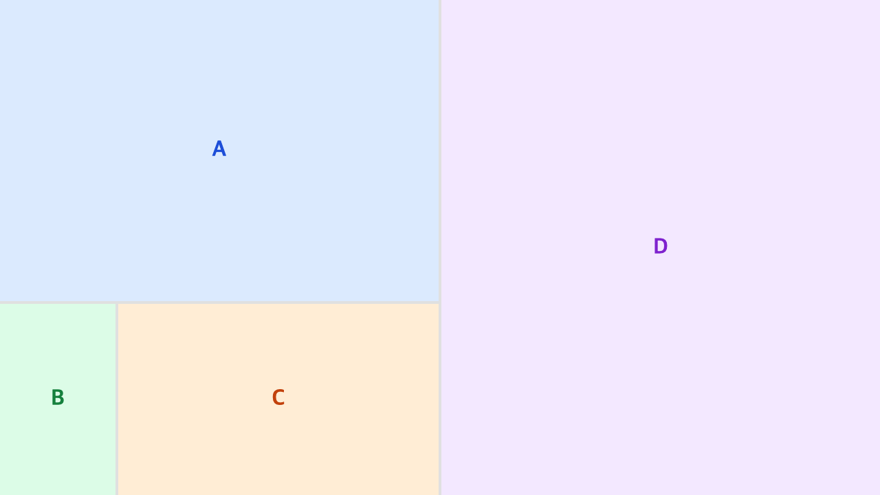
ComponentStore
The tree stores only a string componentKey per panel, never a React element. The ComponentStore maps those keys to the actual React nodes and is passed to TreeLayout via the required components prop. This keeps the tree fully serializable (see Persistence).
createComponentStore(initial?)
Creates a store, optionally seeded from a Record<string, ReactNode>.
const store = createComponentStore({
  sidebar: <Sidebar />,
  editor: <Editor />,
});| Method | Type | Description |
|---|---|---|
register | (key: string, node: ReactNode) => void | Add or replace a mapping |
unregister | (key: string) => void | Remove a mapping |
get | (key: string) => ReactNode | undefined | Look up the node for a key |
has | (key: string) => boolean | Whether a key is registered |
- Create the store once and keep a stable reference (module-level or
useMemo). register/unregistermutate the internalMapbut do not trigger a re-render. To change what's rendered dynamically, swap the tree (setTree) instead of relying on store mutation.- When a panel's
componentKeyis not registered, the panel renders empty (null) and a dev-mode console warning is emitted.
Persistence
Because every value in the tree is primitive, the layout round-trips through JSON.stringify / JSON.parse with no custom serializer. The store lives in your code and is never serialized.
// save
localStorage.setItem("layout", JSON.stringify(tree));

// restore
const tree = JSON.parse(localStorage.getItem("layout")!) as LayoutNode;
Keep store keys stable across releases so restored trees resolve their components.
Panel size constraints
Set a panel's min/max size with minWidth/minHeight/maxWidth/maxHeight (pixels) on PanelNode·SplitNode.
- Each value applies only on the split-direction axis (main-axis) of the panel. A child of a horizontal split uses
minWidth/maxWidth; a child of a vertical split usesminHeight/maxHeight. The cross-axis value is ignored. - An applied constraint is honored consistently by both window/container resize (CSS) and border drag (
resizeBorder), using the same px value. - If you need a minimum on a specific axis, structure the tree so that axis is the main-axis (e.g. place a panel that needs a min height inside a vertical split).
Content overflow
The panel wrapper uses overflow: auto. When your component is larger than the panel, it scrolls instead of being clipped, preserving the component's design integrity. Components should use width: 100% / height: 100% to fill the panel.
useLayoutTree(initialTree)
Hook for managing layout tree state. Returns the current tree plus selectors and mutating helpers.
const {
  tree, setTree,
  firstPanelId, panelIds, hasPanel,
  resizeBorder, splitPanel, removePanel, movePanel, insertPanel,
} = useLayoutTree(initialTree);
Return values
| Return | Type | Description |
|---|---|---|
tree | LayoutNode | Current layout tree state |
setTree | (tree: LayoutNode) => void | Directly set the tree |
firstPanelId | string | null | First panel id found in the tree (pre-order) |
panelIds | string[] | All panel ids in the tree (pre-order) |
hasPanel | (panelId: string) => boolean | Whether a panel exists in the tree |
resizeBorder | (path, borderIndex, delta, totalPixels?) => void | Resize by border index within a split |
splitPanel | (panelId, direction, options?) => string | Split a panel; returns new panel id |
removePanel | (panelId) => void | Remove a panel; auto-unwraps single-child splits |
movePanel | (sourceId, anchorId, position, depth?) => void | Move a panel |
insertPanel | (options: { panel: InsertPanelInit; at?: InsertAt }) => string | Insert a panel; returns new panel id |
Method details
splitPanel(panelId, direction, options?)
Splits a panel by adding a sibling in the given direction. Returns the new panel's id.
splitPanel("editor", "vertical");
// Panel auto-generated id, empty componentKey ("")

splitPanel("editor", "horizontal", {
  newPanel: { id: "preview", componentKey: "preview" },
});
// => "preview"- If the parent split already matches
direction, the new panel is inserted as a sibling - Otherwise the target panel is wrapped in a new split containing the old and new panels
newPanel.id— auto-generated viacrypto.randomUUID()when omittednewPanel.size— defaults to0.5newPanel.componentKey— defaults to""(renders empty until a key is set)
removePanel(panelId)
Removes a panel from the tree. If removal leaves a split with a single child, the split is auto-unwrapped.
movePanel(sourceId, anchorId, position, depth?)
Moves an existing panel next to anchorId. Usually wired to <TreeLayout onMovePanel={movePanel} /> so the built-in drag-and-drop handler forwards position and depth.
position:"top" | "bottom" | "left" | "right"— drop side relative to the anchor paneldepth:0= panel level (sibling),1= parent split level, higher = ancestor split level
insertPanel({ panel, at? })
Inserts a new panel. Returns the new panel's id.
// Append to the root
insertPanel({ panel: { componentKey: "editor" } });

// Insert as sibling of an existing panel
insertPanel({
  panel: { id: "preview", componentKey: "preview" },
  at: { anchorId: "editor", position: "right" },
});panel.componentKeyis required (must be registered in theComponentStore)panel.idis auto-generated when omittedpanel.sizedefaults to1- Omit
atto append at the root level (see Tree utilities for root-append rules)
resizeBorder(path, borderIndex, delta, totalPixels?)
Resizes the border between two adjacent children of a split at path. Honors the adjacent children's split-axis min/max (minWidth/maxWidth in a horizontal split, minHeight/maxHeight in a vertical split). Usually wired to <TreeLayout onResizeBorder={resizeBorder} />. The internal resize handle runs on Pointer Events (setPointerCapture), so it works with mouse, touch, and pen alike.
Selector tips
firstPanelId— convenient for "focus the first panel" or "insert near the top" use casespanelIds—panelIds.includes(id)acts as a visibility check for toggle UIshasPanel(id)— same check aspanelIds.includes(id)but avoids creating a Set/array every render
Tree utilities
Pure functions for inspecting or transforming a tree without the hook. Useful when you already manage the tree state yourself (e.g. with Redux, Zustand, or raw setTree).
import {
  getFirstPanelId,
  getPanelIds,
  insertPanelIntoTree,
} from "@dannysir/floating-components";
getFirstPanelId(tree): string | null
Returns the id of the first panel encountered in pre-order traversal, or null if the tree has no panels (shouldn't happen in a well-formed tree).
getPanelIds(tree): string[]
Returns all panel ids in pre-order.
insertPanelIntoTree(tree, panel, at?): LayoutNode
Returns a new tree with panel inserted. panel must be a complete PanelNode.
// Append at root
insertPanelIntoTree(tree, panelNode);

// Insert as sibling of an anchor
insertPanelIntoTree(tree, panelNode, { anchorId: "editor", position: "right" });
Root append rules (when at is omitted):
- If the tree root is a
split, the panel is appended to the end ofchildren(bottom for vertical, right for horizontal) - If the tree root is a
panel, the root is wrapped in a horizontal split with the new panel on the right
If the anchor is not found in the tree, the original tree is returned unchanged (with a dev-mode warning).
Drag & Drop
The renderer registers HTML5 drag-and-drop listeners on each panel. When a user drags a panel, the drop target is computed from the hovered region, then onMovePanel(sourceId, anchorId, position, depth) is called.
On touch devices, HTML5 DnD doesn't fire, so a separate path is used. Press the handle (dragHandleSelector), or long-press (450ms) the panel when there's no handle, to start dragging; a translucent ghost follows the finger. The panel under the release point is resolved with elementFromPoint, and onMovePanel is called with the same drop rules below. Because the coordinate math is identical, the drop-target priority, position, and depth behave exactly as with the mouse.
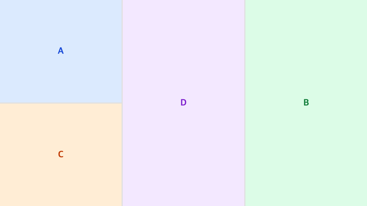
Drop target priority
The region around the hovered panel is partitioned:
- Root edge (outer ~5% of the root container) — drops at the top level.
depthequals the number of ancestor splits. - Parent split edge (outer ~15% of the enclosing split) — drops at the parent split level.
depth = 1. - Panel interior — drops at the hovered panel level.
depth = 0.
Within each level, the cursor position decides position:
- Left/right third →
"left"/"right"(results in a horizontal split) - Top/bottom third →
"top"/"bottom"(results in a vertical split)
depth parameter
depth shifts the insertion point upward through the anchor's ancestor chain:
0— insert as a sibling of the anchor panel itself1— insert as a sibling of the anchor's parent splitn— insert as a sibling of the n-th ancestor split>= ancestors.length— insert at the root level
This lets users drop near a panel to split it, or near the split edge to create a broader sibling.
Types
type SplitDirection = "horizontal" | "vertical";

interface PanelNode {
  type: "panel";
  id: string;
  size: number;            // flex ratio
  componentKey: string;    // key into the ComponentStore
  minWidth?: number;       // pixel min width (applies when child of a horizontal split)
  minHeight?: number;      // pixel min height (applies when child of a vertical split)
  maxWidth?: number;       // pixel max width
  maxHeight?: number;      // pixel max height
}

interface SplitNode {
  type: "split";
  direction: SplitDirection;
  size: number;            // flex ratio
  children: LayoutNode[];  // two or more children
  minWidth?: number;
  minHeight?: number;
  maxWidth?: number;
  maxHeight?: number;
}

type LayoutNode = PanelNode | SplitNode;

type DropPosition = "top" | "bottom" | "left" | "right";

// insertPanel / insertPanelIntoTree helpers
interface InsertPanelInit {
  componentKey: string;  // required
  id?: string;           // auto-generated when omitted
  size?: number;
  minWidth?: number;
  minHeight?: number;
  maxWidth?: number;
  maxHeight?: number;
}

interface ComponentStore {
  register: (key: string, node: ReactNode) => void;
  unregister: (key: string) => void;
  get: (key: string) => ReactNode | undefined;
  has: (key: string) => boolean;
}

interface InsertAt {
  anchorId: string;
  position: DropPosition;
}
Design notes
SplitNodehas noid— paths (number[]) are used for identification. IDs would be redundant with structural paths and break when a split is auto-unwrapped.- A
SplitNodewith a single child is auto-unwrapped afterremovePanel/movePanel, keeping the tree flat. sizeis a flex ratio, not pixels. Siblings share proportionally.